10 Typography Tips to Elevate Your Designs

10 Typography Tips to Elevate Your Designs
Ever wondered why some designs just pop while others fall flat? The secret sauce is often in the typography. Great typography can transform your work, making it more polished, professional, and engaging. To help you level up your designs, I've gathered ten typography tips that you can start using right now. Whether you're a seasoned designer or just starting out, these tips are practical, actionable, and sure to improve your typography game.
1. Choose Professionally Designed Fonts
When it comes to fonts, quality matters. Professionally designed fonts are crafted with care, offering a range of styles and weights that add versatility to your designs. Plus, they undergo rigorous quality checks, ensuring they look great across all platforms and devices.
Design Tip: Many type foundries offer free trial versions of their fonts. Take advantage of these trials to experiment with different typefaces.
Bonus Tip: To streamline the process of changing and replacing fonts, you can use Font Replacer Ultimate. This plugin allows designers to easily swap, change, and replace fonts, ensuring consistency and alignment with brand values.
2. Apply Hierarchy
A well-designed hierarchy guides the viewer’s eye through the content, highlighting what’s most important. You can create hierarchy by varying font sizes, styles, and colors. This not only makes your design more visually appealing but also makes it easier to digest information.
Design Tip: When designing, ask yourself, “What should the reader notice first, second, third…?”
3. Use Grid Systems
Grids are your best friend when it comes to layout. They divide your design into columns and rows, providing a framework for placing text and images consistently and orderly.
Here are a few types of grids to consider:
- Manuscript Grid: Ideal for book layouts.
- Column Grid: Great for web designs.
- Modular Grid: Perfect for complex designs with lots of elements.
- Baseline Grid: Ensures consistent line spacing.
- Hierarchical Grid: Flexible and good for non-traditional layouts.
Design Tip: Experiment with different grid types to find the one that best suits your project.
4. Don’t Mix Too Many Font Styles
Less is more when it comes to font selection. Using too many different fonts can make your design look cluttered and unprofessional. A good rule of thumb is to stick with no more than three different fonts.
Design Tip: Create contrast by pairing a serif font with a sans serif font, but avoid using fonts that are too similar.
Pro Tip: If you decide to change your font combinations later, Font Replacer Ultimate makes it a breeze to swap out fonts without disrupting your entire design.
5. Use Contrast
Contrast isn't just about font choices. It’s also about size, color, and weight (like bold versus light). Effective use of contrast helps establish a clear hierarchy and guides the reader’s eye.
Design Tip: Don’t limit contrast to typography. Incorporate it into other design elements like shapes, images, and colors for a cohesive look.
6. Embrace Whitespace
Whitespace (or negative space) is often underestimated, but it’s a powerful tool in design. It gives your elements room to breathe and can draw attention to the most important parts of your design.
Design Tip: Start by stripping away everything that isn’t necessary, then slowly reintroduce design elements until you achieve balance.
7. Adjust the Leading
Leading, or line spacing, refers to the vertical space between lines of text. Proper leading is crucial for readability. Too tight, and your text looks cramped; too loose, and it’s hard to follow.
Design Tip: A leading value between 1.2 to 1.5 times the font size is usually a good starting point.
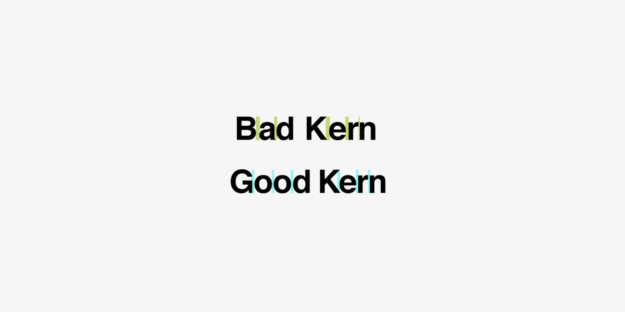
8. Pay Attention to Kerning
Kerning involves adjusting the spacing between individual letters to improve the overall appearance and readability of text. It’s especially important in logos and headlines where precision matters.
Design Tip: Want to practice your kerning skills? Check out this fun kerning game to sharpen your eye!
9. Use OpenType Features and Glyphs
OpenType features and glyphs can add a lot of flair to your typography. They include things like ligatures, alternate characters, and small caps that make your text look more refined and unique.
Design Tip: In Adobe Illustrator, access OpenType features by going to the “Window” menu and selecting “Type > OpenType” or “Type > Glyphs.”
Extra Tip: If you’re updating an existing design, Font Replacer Ultimate can help you seamlessly integrate these features without the hassle of starting from scratch.
10. Use Proper Punctuation
Good typography isn’t just about fonts—it’s also about punctuation. Correctly using punctuation marks like hyphens, dashes, and quotation marks can make your text clearer and more professional.
Here’s a quick rundown:
- Hyphen (-): Joins two words to form a compound word.
- En Dash (–): Indicates a range or connection between words.
- Em Dash (—): Breaks up thought or adds emphasis.
- Midpoint (·): Use instead of bullets for a more subtle list separator.
- Quotation Marks (“ ”): For direct quotes or special phrases.
- Apostrophe (’): Shows possession or omission of letters.
- Ellipsis (…): Indicates omitted text or trailing thoughts.
- Fractions (½): Use the correct symbols for a polished look.
Pro Tip: Consistency in punctuation is key to a clean design. Use Font Replacer Ultimate to ensure your punctuation matches your chosen font’s style perfectly.
Conclusion
Typography is the backbone of great design. By incorporating these ten tips into your workflow, you’ll see a noticeable improvement in your designs. And remember, whether you’re switching up fonts or fine-tuning details, Font Replacer Ultimate is an invaluable tool that can save you time and ensure your designs remain consistent and aligned with your brand values.
Happy designing!